Wireframes
Use HTML wireframes to compare layouts, hierarchy, navigation, and responsive structure.
Wireframes show how a page or flow is organized without presenting a finished design. An agent can turn the same brief into several HTML wireframes that you can open at desktop and mobile sizes.
Can the structure be judged before the surface is finished?
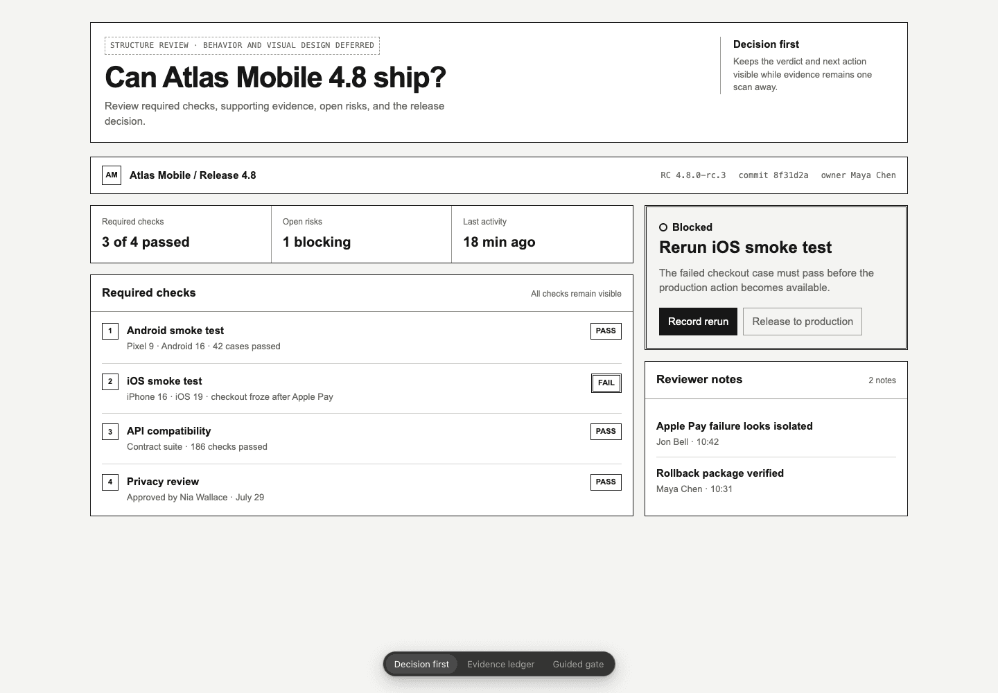
- Hierarchy
- The release decision and blockers dominate the page.
- Boundary
- Primary and supporting actions remain visibly separate.
- Reflow
- The same content order survives at a narrow viewport.
What a wireframe can show
- content hierarchy and density;
- navigation and page structure;
- responsive layout;
- different ways to organize the same content;
- the order and grouping of controls.
Keep the focus on structure
Use realistic content, clear boundaries, and a restrained palette so people can compare layout and structure before discussing color, typography, and branding.
PrototypesSee how a working HTML flow can show behavior and state.